These ideas run from a brass rail under an existing shelf to recessed shelving that needs a stud saw and an electrician, so the deciding factor is whether you own the wall or only the holes you leave behind.
Renters get almost half these options, but the ones with toggle bolts and Command strips stop where recessed shelving and hardwired LED strips begin.
The half-inch pipe that looks flimsy and the one-inch pipe that needs solid blocking are both in the industrial section, and that range matters more than any single measurement.
[link-whisper-related-posts]1. Shelves in the Corner
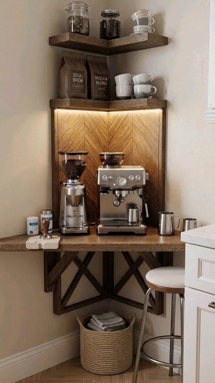
Corner shelves turn the dead zone where cabinets refuse to meet into usable storage. 2 floating shelves at a right angle hold daily-use items without stealing wall space from elsewhere.
What I watch for is the depth.
A corner shelf that is too deep becomes awkward to reach into, and anything too shallow will not hold a standard dinner plate. The corner shelf setup makes use of a spot that often looks like an afterthought.
For renters, floating corner shelves with keyhole brackets leave smaller holes than a full bracket system and hold reasonably well per stud if you hit the stud.
In older homes with plaster and lath, I would switch to toggle bolts rated for the same weight and accept that the shelf might flex slightly.
2. Hooks on Open Shelves
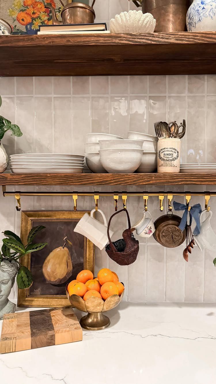
A brass rail screwed to the underside of a shelf adds hanging storage for mugs, spoons, or small tools without eating counter space.
The visible rail uses S-hooks in a matching finish, which matters more than people think: mixed metals read as "found what was cheap" rather than "chose what worked."
Before buying, I measure the shelf thickness. Most rails need at least 3 quarters of an inch of solid wood or plywood to bite into; particleboard shelves will strip out.
A rail that sits flush to the shelf front lets mugs hang clear of anything below. I would keep the rail flush to the shelf front, since a set-back rail lets hooks swing and clatter.
3. Floating Shelves
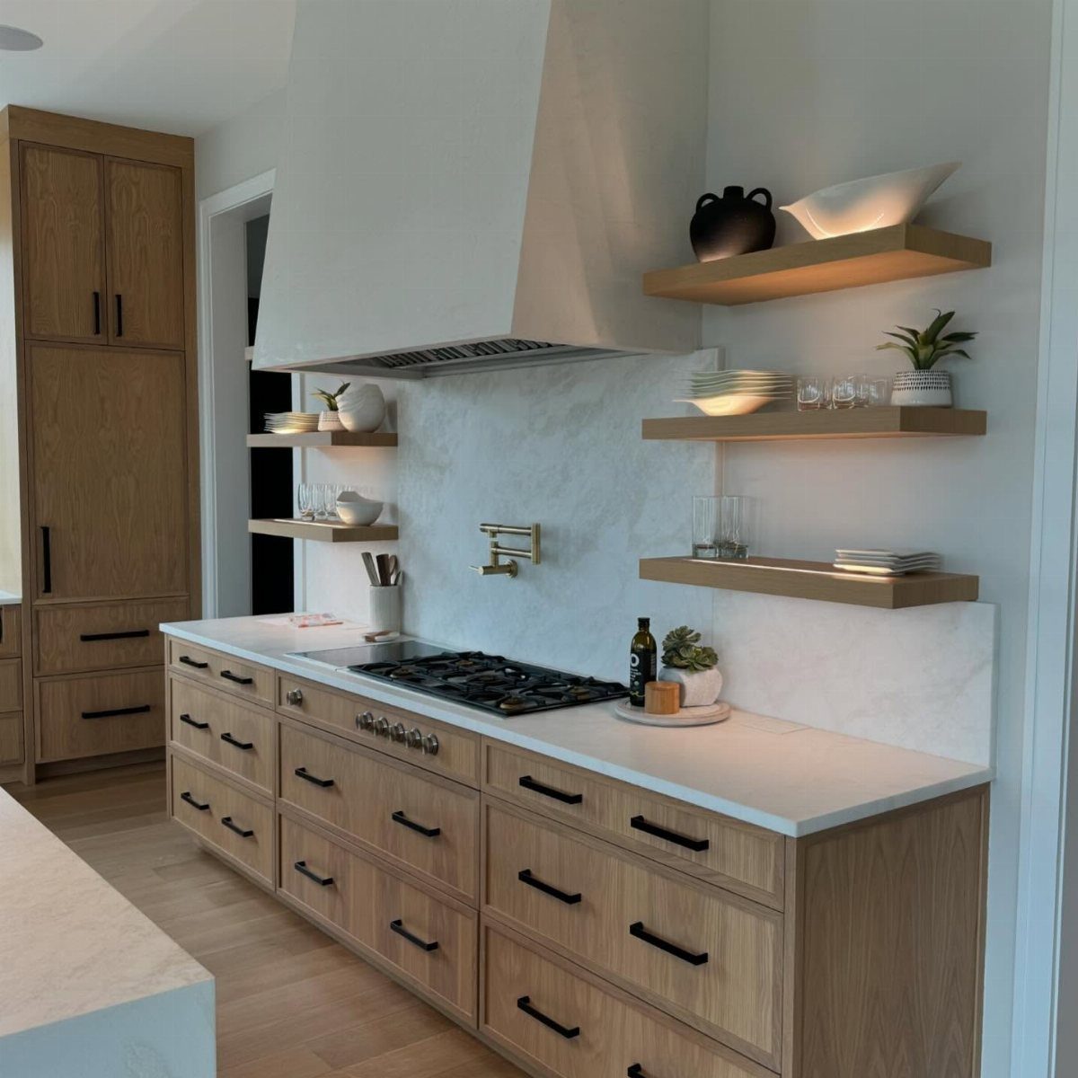
Floating shelves hide their brackets inside the shelf itself, which gives that clean line where the board seems to grow from the wall.
What holds them is what matters. A floating shelf on drywall alone, even with toggle anchors, will eventually pull down under kitchen weight.
I would not install these without a stud finder and at least 2 studs per shelf, or accept that the load drops to lightweight display. The wood tone matching the base cabinets ties the look together without matching exactly.
4. Open Shelves with Cabinets
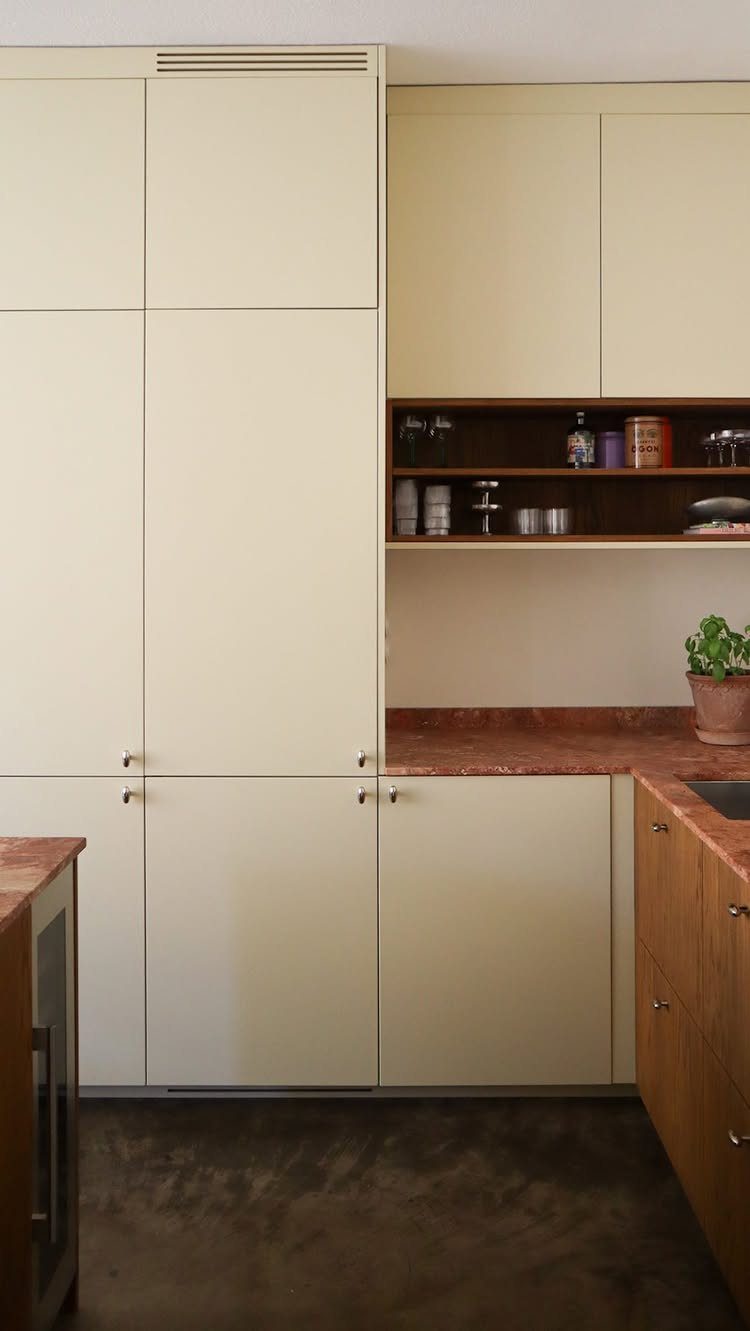
A single open shelf under a run of upper cabinets breaks up the wall of doors and gives you a place for the jars and containers you reach for constantly.
Dark wood against cream cabinets creates contrast that would read as cluttered if the whole kitchen were open, but stays controlled as one accent band.
What I check first is the height. The shelf sits below the uppers with enough clearance for a jar to slide out upright; more is better, and extra is more comfortable.
The items on it need to earn their spot: daily-use containers, not the specialty pan you pull out twice a year. Everything else stays behind cabinet doors where dust and grease find it harder to settle.
5. Use of Natural Materials
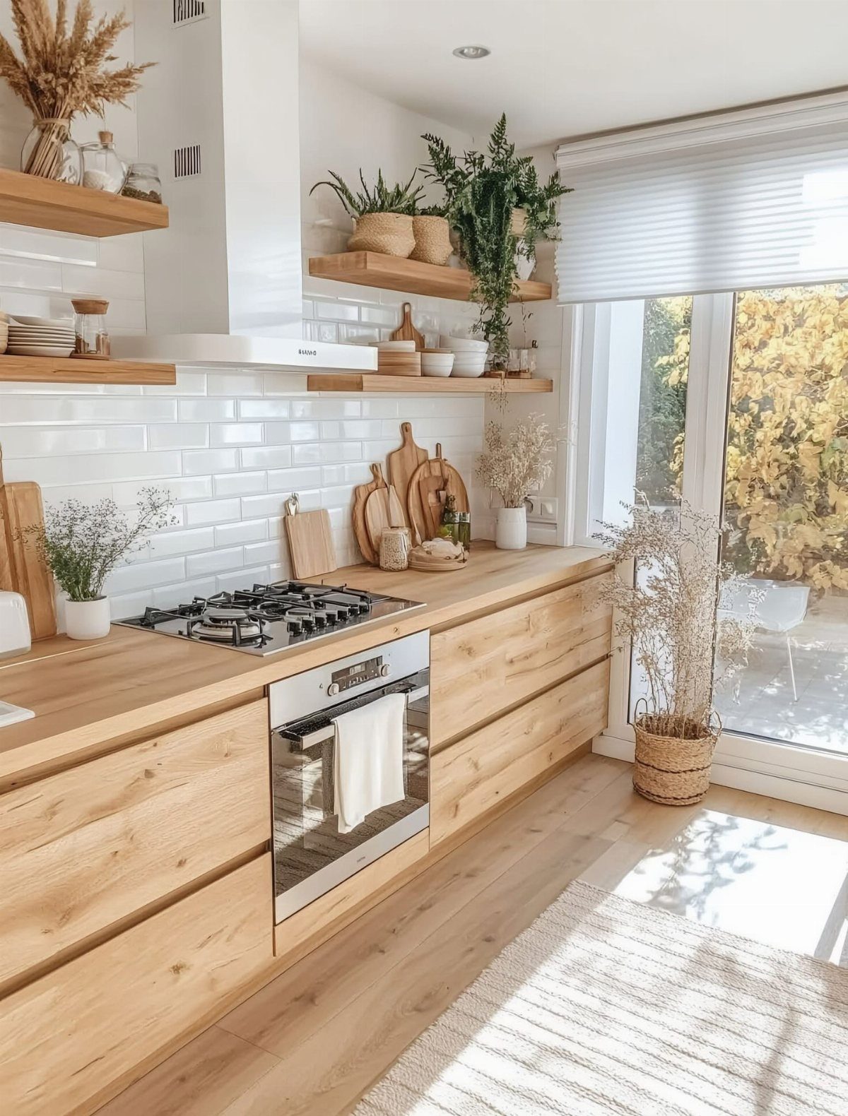
Wood shelving against white subway tile warms a kitchen that could otherwise feel sterile, and the light tone keeps the whole wall from feeling heavy.
Natural materials show wear honestly, which I prefer to the chipped paint that makes a cheap shelf look tired.
You will do more upkeep. Unsealed wood absorbs cooking grease and water; I would finish these with a food-safe hardwax oil and reapply on a schedule in a kitchen that sees real use.
The wood floats on hidden hardware, so the grain reads uninterrupted and the wall stays visually quiet. For renters, a solid wood shelf on a simple L-bracket reads nearly as warm and moves with you.
6. Shelving for Small Kitchens
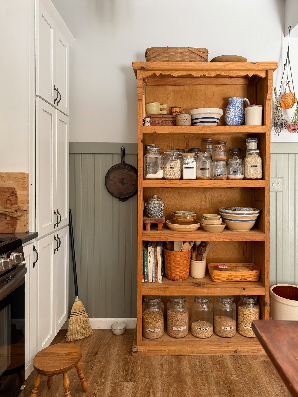
A tall open hutch against a wall turns vertical space into pantry storage when cabinet count is fixed, as it often is in rentals or small galley kitchens.
A unit that organizes jars, bowls, and cookbooks in zones keeps the open look from becoming visual noise.
What I measure before buying is the footprint versus the aisle width.
A hutch that is too deep needs a lot of clear floor in front to open a lower drawer and still let someone pass; in a narrow kitchen, that leaves a tight squeeze.
I would also anchor it to the wall at the stud, even if it feels stable empty. A full hutch of glass jars weighs more than you’d guess, and small kitchens mean more bumping into things.
7. Industrial Kitchen Shelves
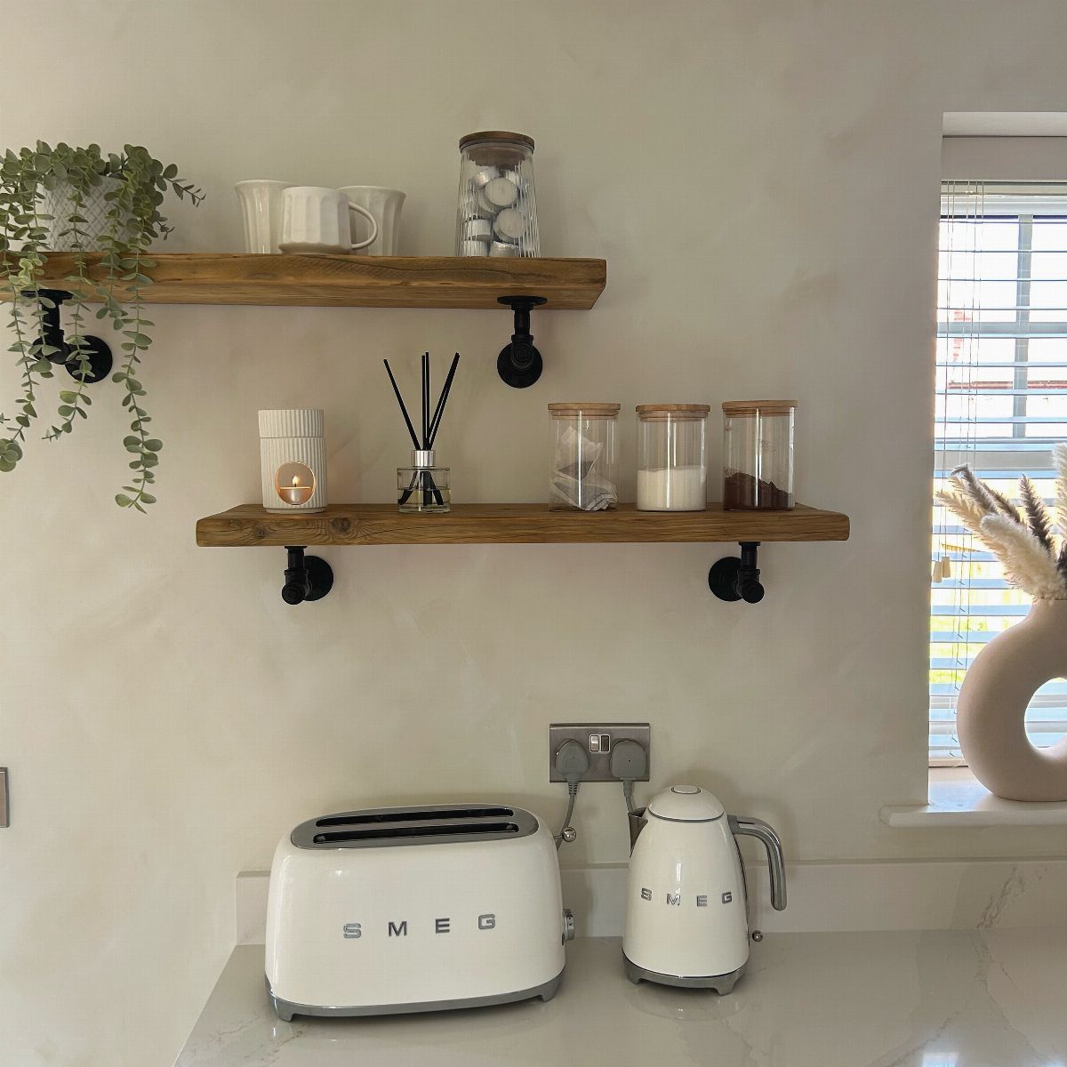
Black iron pipe fittings and flanges bolted to wall studs carry thick wood planks with visible grain and knots. The hardware is the look; skip it and you have plain shelves, not industrial.
What I check is the pipe diameter. Half-inch pipe looks flimsy above a long span, one-inch gets heavy fast and needs solid blocking in the wall.
The visible example keeps it to 2 shelves, which is right; stacking more reads as warehouse rather than kitchen. I would seal the wood with a matte polyurethane, since industrial style accepts wear but not water stains from wet mugs.
8. Shelves Above the Sink
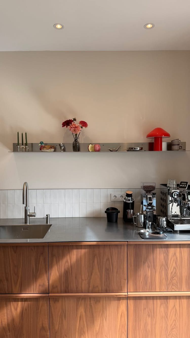
A shelf running the width of the sink window keeps daily items at hand without sacrificing the light. Stainless steel matches the sink and resists the water spotting that ruins wood here.
What I measure is the height above the faucet.
Tight spacing above the sink blocks pitchers and carafes; too much depth puts every reach at an awkward stretch. The example shows a lamp and flowers, which I would skip for the shelf I use daily.
Fresh flowers over a dish rack wilt fast in the splash zone, and wet hands make outlets a hazard to place nearby. A rail or small ledge at the back stops items from sliding into the sink during washing.
9. Color Coordination
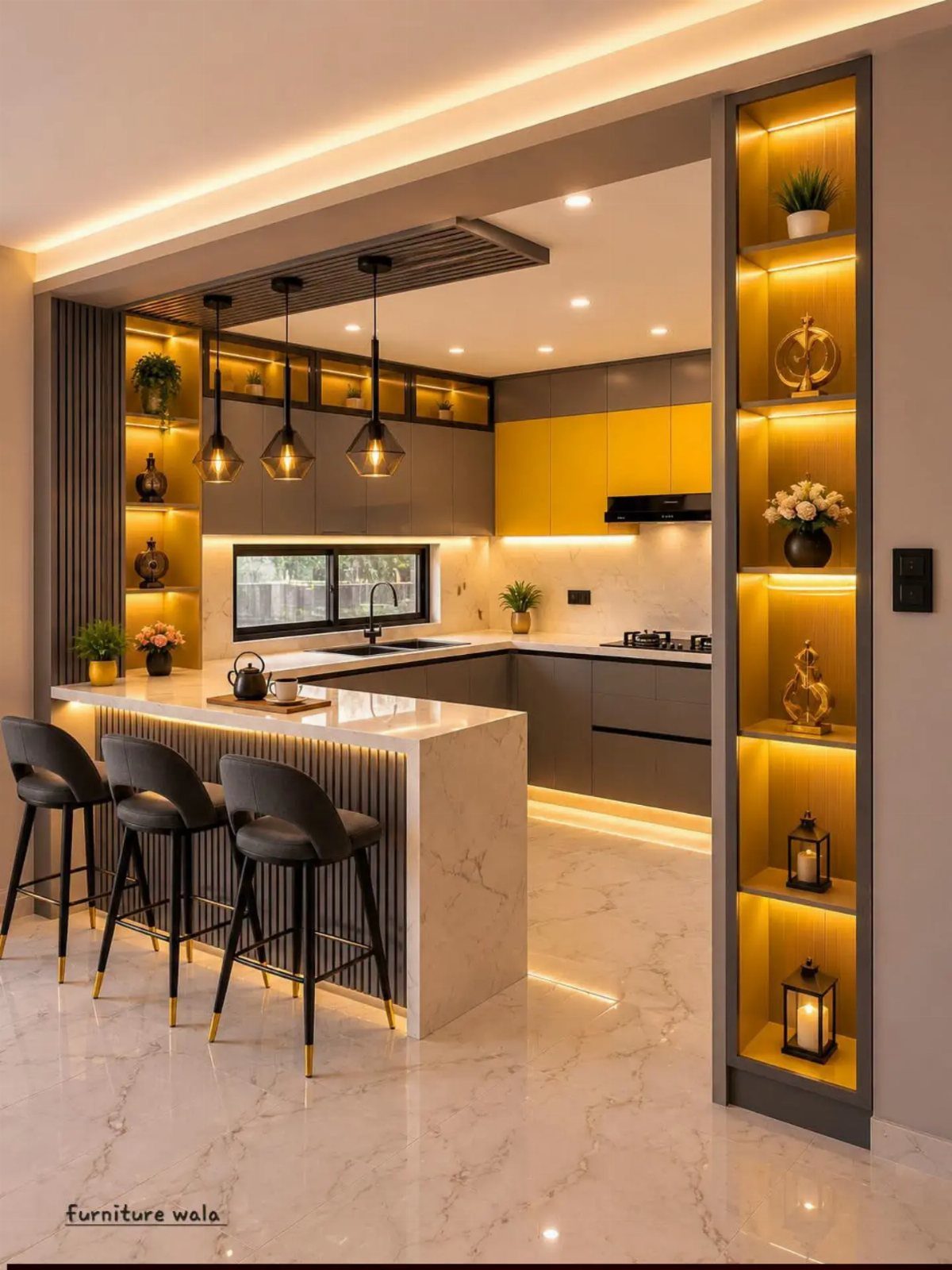
Backlit display shelving makes color coordination deliberate rather than accidental, since the light draws the eye to whatever sits there. Gray cabinets with a yellow accent create a palette narrow enough that the open display reads as planned.
What I would avoid is matching the shelf contents to the room color too exactly. A shelf of only yellow items looks like a store display; the example mixes gray and white objects to stay livable.
For a retrofit, battery LED strips set to warm white give a similar glow without the electrical work, though they need recharging on a schedule.
10. White Dishes on Open Shelves
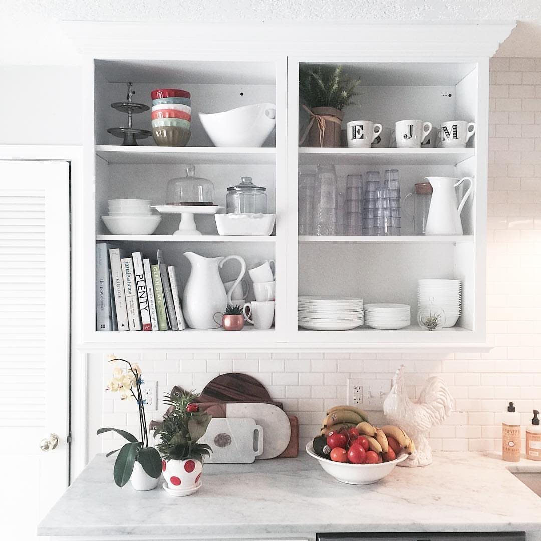
White dishes against white shelving disappear into a calm mass that lets the shapes read: the curve of a pitcher, the stack of plates.
The effect depends on keeping the white consistent; a cream plate next to a bright white bowl breaks the calm.
What I watch for is the dish finish.
Gloss reflects light and stays cleaner-looking; matte shows every chip and water spot. Cookbooks add texture on open shelves, but I would limit them to two or three; more competes with the dish shapes.
Mugs are the hard part, since handles break the visual line. I would store them hook-side-out or replace a few with handle-less cups for display.
11. Plants on Open Shelves
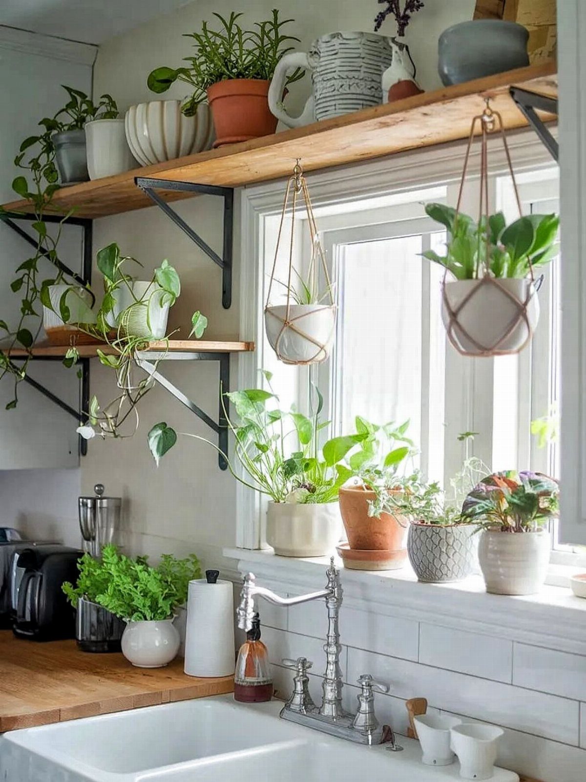
Herbs and trailing plants above the sink get the humidity and light they need, and the green tones warm wood shelving without adding clutter. The example shows mostly pothos and philodendron, which survive the low light of many kitchen windows.
Even glazed pots leave rings, and overwatering drips. I would keep plants in their nursery pots set inside cachepots, and lift them out to water in the sink.
Weight adds up fast; a shelf of wet soil and terracotta needs bracketing at every stud, not every other. Hanging planters need a hook rated for wet weight, not a simple adhesive.
12. Vintage Kitchenware on Open Shelves
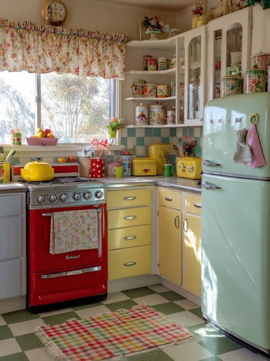
Corner shelves in a retro kitchen hold vintage tins that would hide in a cabinet, their graphics and patina part of the color story.
The red stove, mint fridge, and yellow cabinets set a palette that makes the tins look chosen rather than collected.
What I look for in vintage storage is function, not only look.
Tins with tight lids keep flour and coffee fresh; open or rusted ones are display only. The corner placement works because these items are light; a stack of cast iron would need stronger bracketing.
I would not put daily-use items this high in a corner; the tins are decorative, and the practical stuff stays at counter height where you can reach it without a step.
13. Dark Shelves with Light Dishes
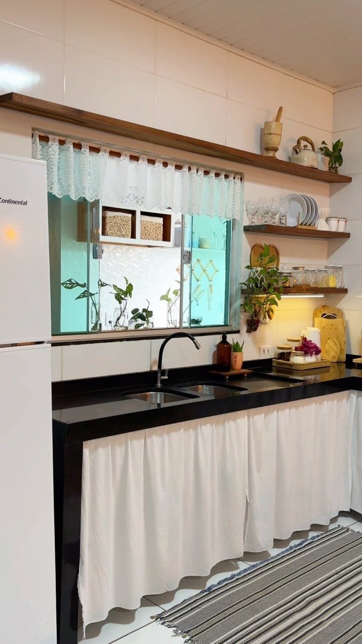
Dark shelves make light dishes read as objects rather than clutter, each plate and bowl defined by the contrast. The white tile behind keeps the wall from feeling heavy.
I would check the wood finish before installing. Open shelves near a sink take splatter; a dark stain hides water marks better than paint, which chips pale at the edges.
The white fabric skirt below the counter in the visible example is a rental move I would borrow: it hides plumbing without a cabinet install and softens the whole run.
14. Add Personality
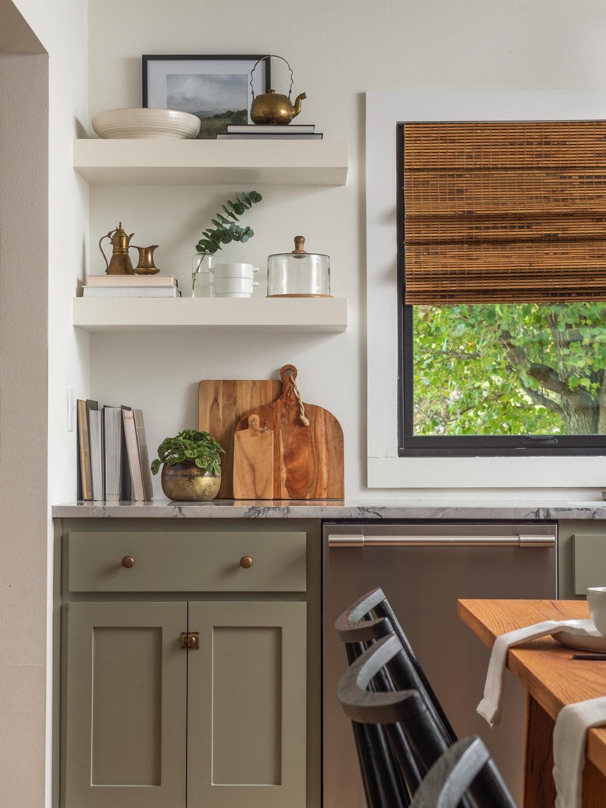
A brass kettle and stacked books on open shelves turn storage into something you actually look at, not just through.
Bamboo blinds and painted cabinetry do the same work here: they give the wall enough warmth that the framed prints feel gathered over time.
Even art needs editing.
I would rather see two pieces I remember than six I skim. A couple of framed pieces read as personality; more than that and the wall starts feeling like a spare desk got parked there.
The books should be ones you pull down, not props with blank spines. For a renter, Command strips behind light frames save the wall, but I would not trust them above a stove where heat weakens the adhesive.
15. Recessed Shelving
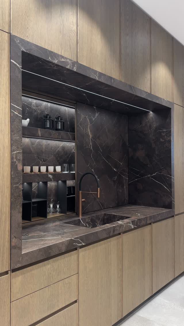
Recessed shelving set into the wall keeps the face flat and the items protected from aisle traffic, which matters in a narrow kitchen.
The dark veined marble lining in the visible example is the finish that makes it read as designed, not as a hole left by mistake.
This is new-build or renovation work; you are cutting into studs and rerouting whatever lives in that wall. I would plan shallow for glasses and deeper for bottles, and check for plumbing before sawing.
The integrated lighting in the visible example needs an outlet or hardwire inside the recess, which means an electrician unless you are comfortable with Romex.
16. Open Shelves in the Pantry
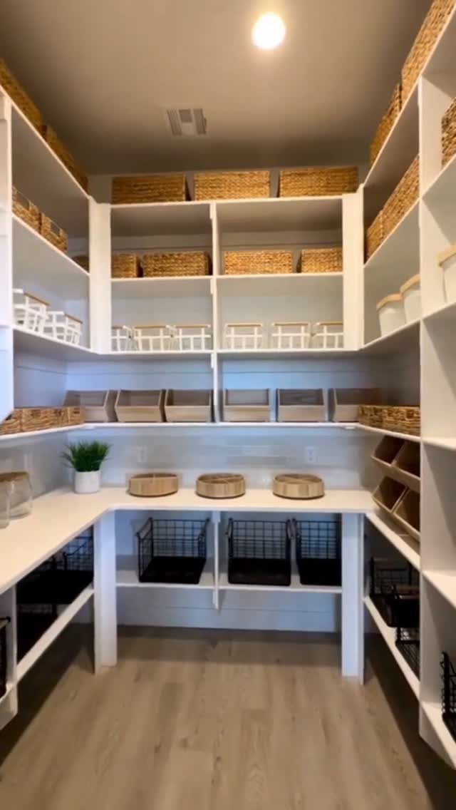
Open pantry shelving lets you see the last jar of oats before you run out, and the woven baskets in the visible example hide the visual chaos of snack bags and loose packets.
White paint keeps a walk-in from feeling like a closet.
Tighter spacing fits cereal boxes upright; leave more height for bulk flour or a standing mixer if you store small appliances here. The wire bins in the visible example work for potatoes and onions, which need air.
I would not put open oil or honey on a high shelf; the drip down the front of the jar becomes a line of ants fast.
17. Incorporate Decorative Elements
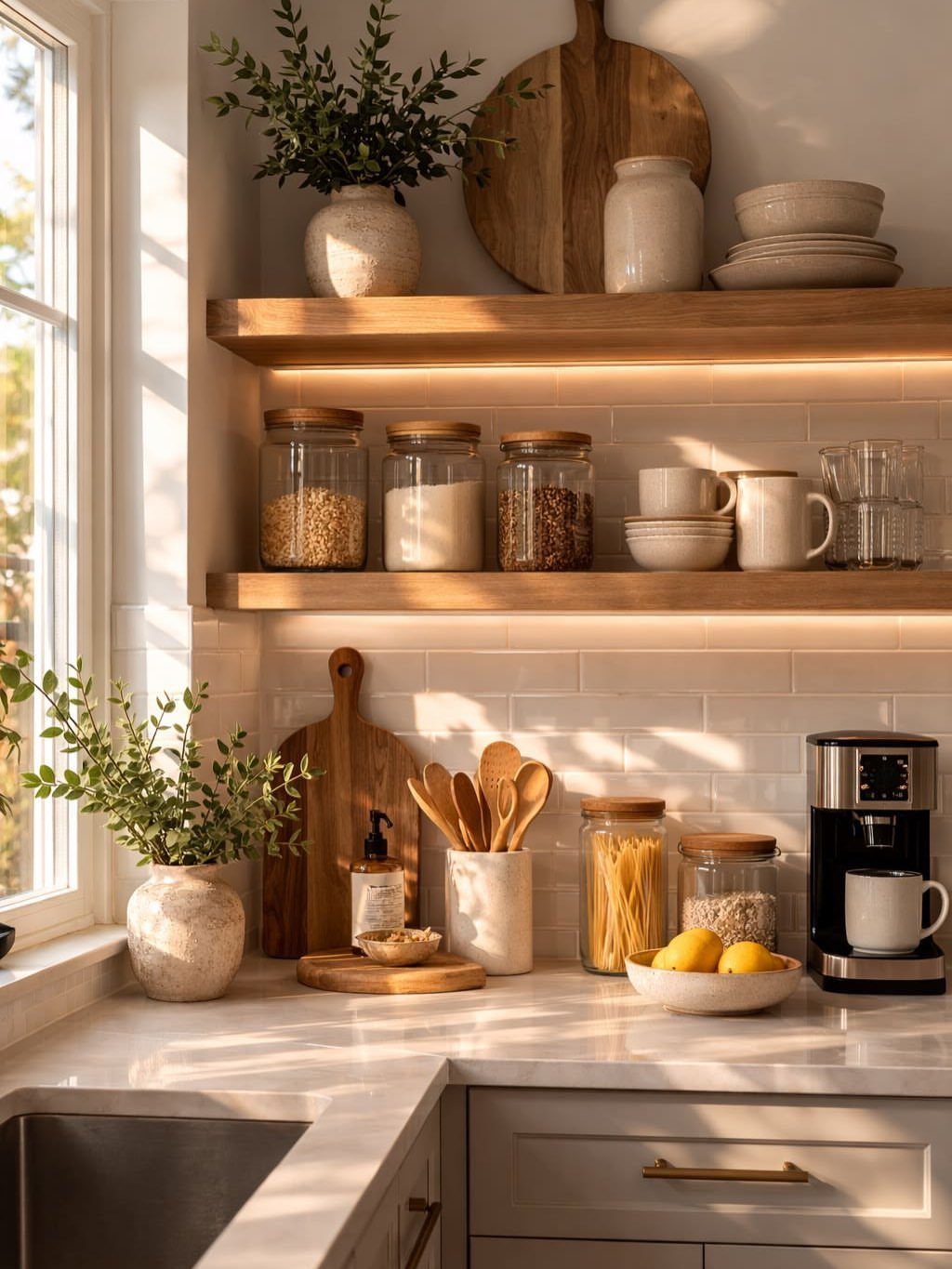
2 ceramic vases with cut branches on kitchen shelves add height variation that breaks the horizontal run of plates and jars. The under-shelf lighting in the visible example makes the branches cast shadow, which adds depth plain dishes do not.
I would keep the plant material dry. Fresh branches drip and drop; dried or faux ones keep the shelf clean.
The cutting boards leaned against the backsplash work as texture, but I would limit them to two; more blocks the light and the reach. Glass pantry jars should share one lid style, or the shelf looks collected rather than arranged.
18. Lighting for Open Shelves
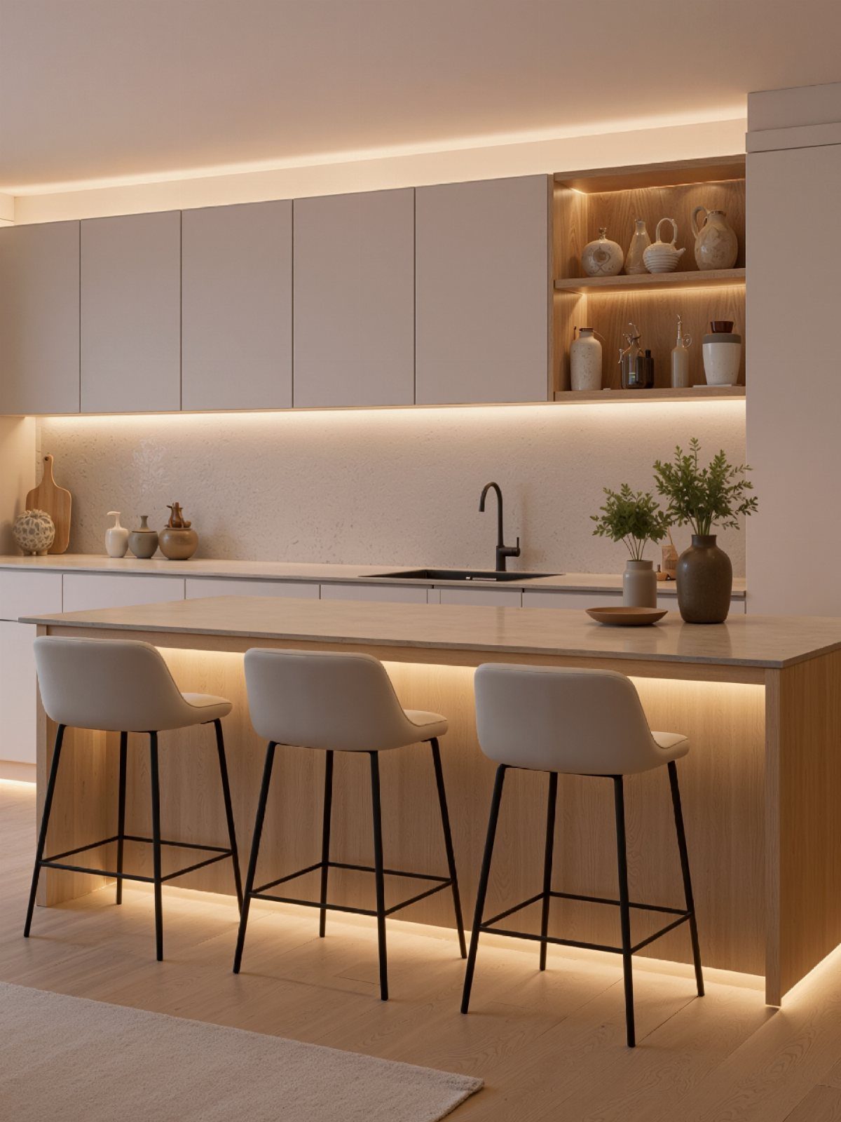
Warm strip lighting under open shelving turns the display into a feature after dark and fills the shadow that upper cabinets usually cast on the counter.
The visible example runs LED along the underside of the niche and the island base, which keeps the light source hidden.
What I would decide first is the color temperature. Warm white, 2700K to 3000K, flatters food and skin; anything cooler reads as clinical.
Battery strips work for a trial run, but I would wire this if I planned to stay. Dimmable drivers cost more but matter in a kitchen that serves as dining room; full brightness after dark is harsh.
19. Tiles Between Shelves
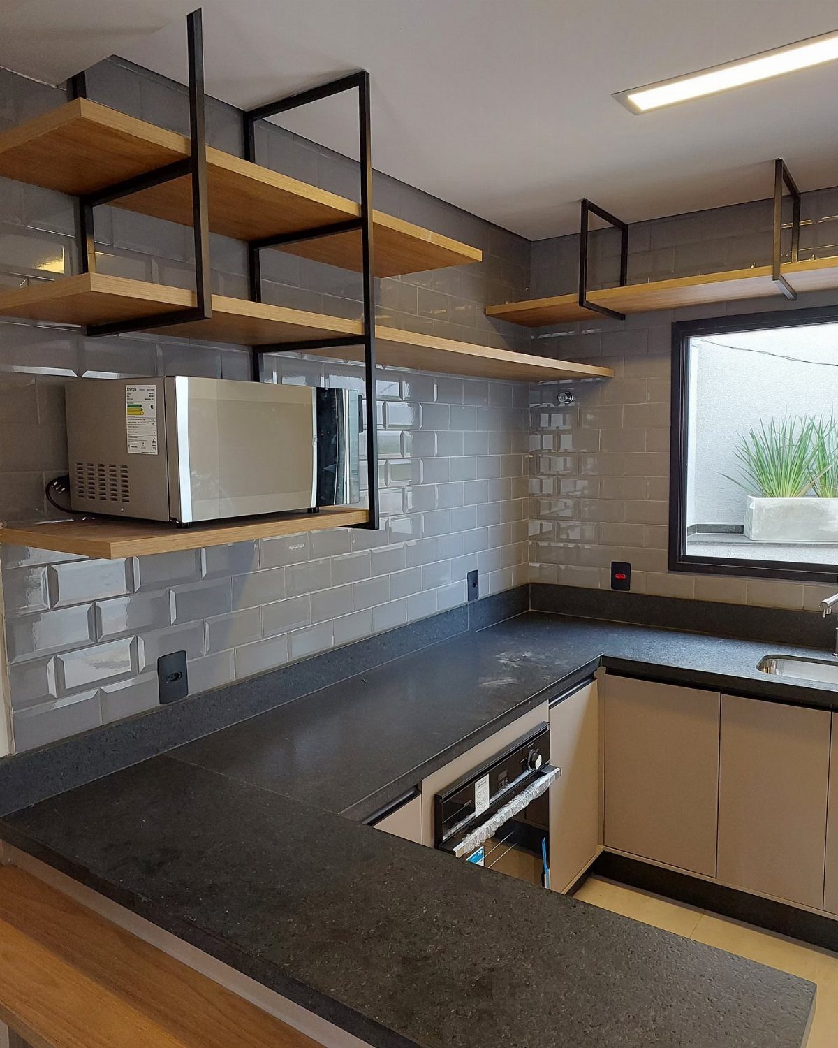
Gray subway tile set in a running bond behind open shelves gives the wall enough pattern to matter without competing with what sits on the wood.
White grout would have blended everything into a single flat plane; the dark grout is what makes this read as a deliberate choice.
I would check the shelf bracket placement before tiling. A flange or rod through tile needs a hole drilled with a diamond bit, which is slow work and easy to crack.
20. Shelves Near Windows
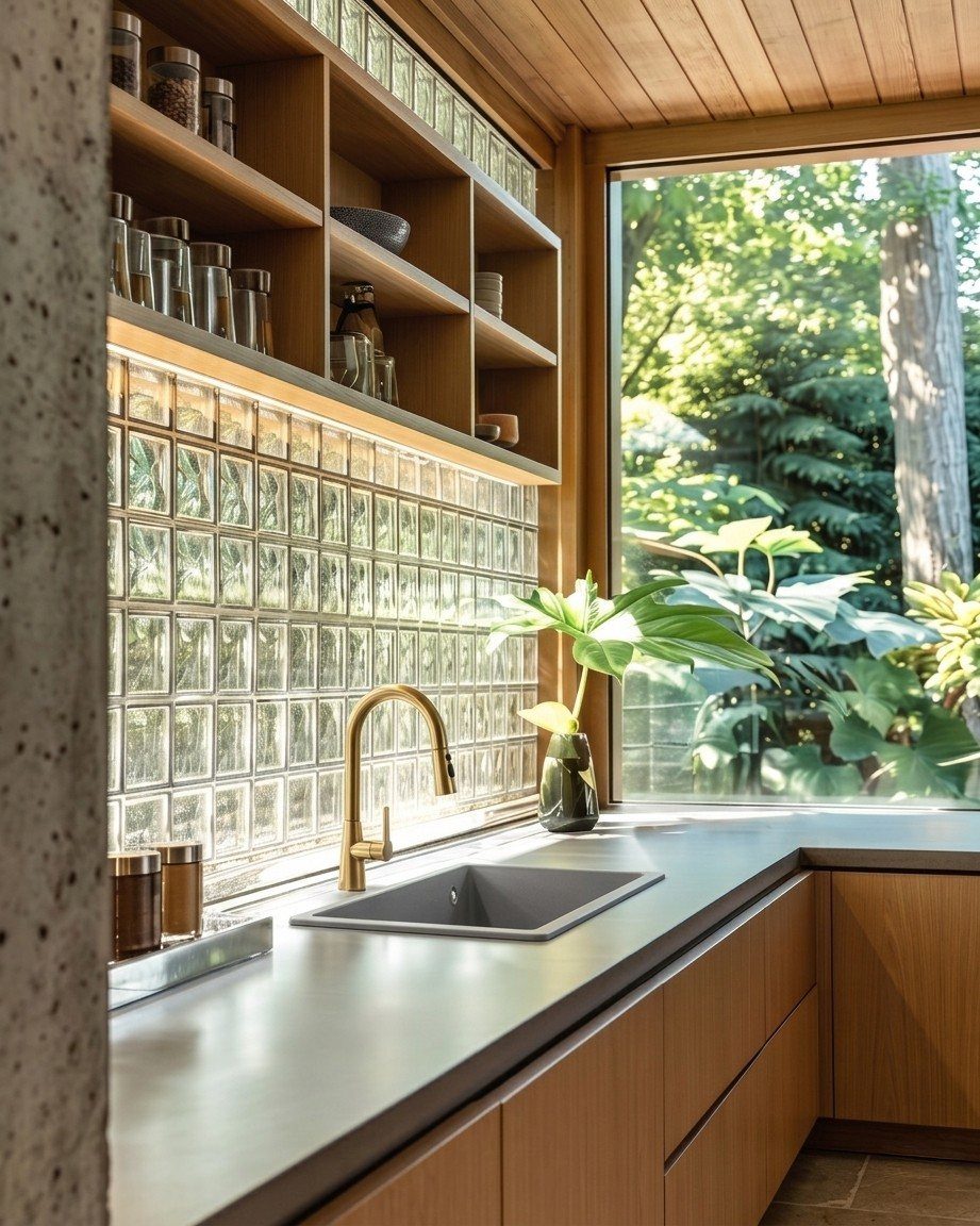
Open shelves built into the wall beside a window borrow natural light that would otherwise fall on blank wall, and the glass jars in the visible example glow with it.
The wood matches the counter, which keeps the shelves from reading as an afterthought.
What I would check is the sun angle. Direct morning light on clear glass turns cooking oil rancid fast, and herbs fade to gray in a season.
Direct sun through a kitchen window will fade anything you leave in clear jars; opaque canisters or a shaded wall are the safer bet.
The glass block backsplash in the visible example is its own light source; I would not add under-shelf lighting here, since the wall already does the work.
21. Uniform Glass Storage Jars
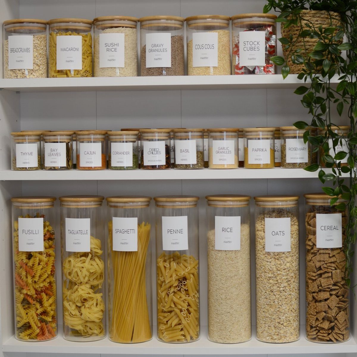
Uniform glass jars with wooden lids and simple labels turn dry goods into a display that stays readable because every container speaks the same visual language.
The white shelving behind them is what makes the wood lids pop; against wood shelves, the effect would muddy.
What I would decide before buying is the jar mouth. Wide mouths fit a measuring cup; narrow ones look tidier but mean pouring or a funnel.
The labels in the visible example are plain text on white, which I would keep; colored borders or script fonts turn pantry into craft room fast.
Buying every matching jar at once runs to real money, and half-matched looks worse than deliberately mixed; I would rather stage it and mix finishes on purpose.
22. Countertop Spice Shelving
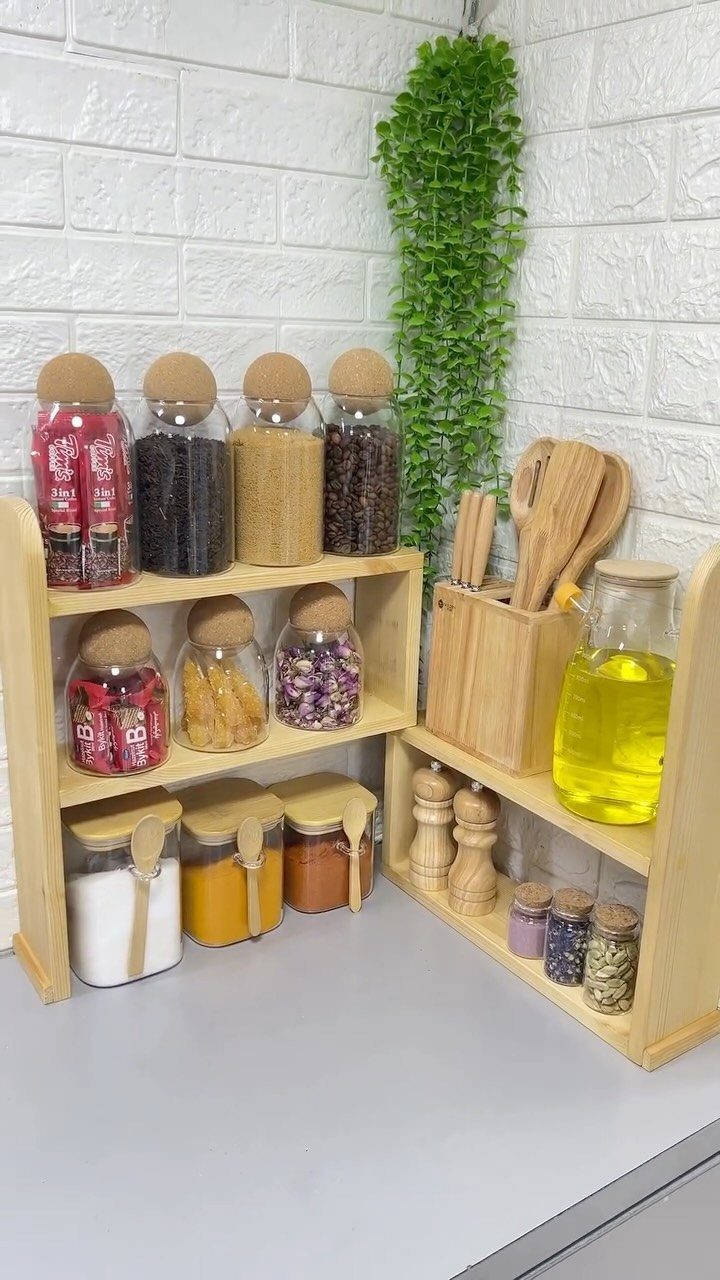
A tiered corner shelf on the counter keeps spices at hand without the drawer rummaging that slows cooking, and the stepped height means every jar stays visible.
The visible example runs wood against faux brick, which is a warmth play; real brick would read the same.
What I would measure is the counter depth lost to the stand. A deep rack in a small kitchen steals prep space you need; shallow tiers or a wall-mounted alternative suit tighter quarters.
The glass jars in the visible example are uniform, but spice shelving is where I would allow mixed containers, since the color of the spices themselves provides the order.
I would keep oil off the counter stand; it drips, attracts dust, and the bottle shape does not tier neatly anyway.
Pros and Cons of Open Shelving
Open shelving makes a kitchen feel lighter than cabinets because the wall stays visible. That openness comes at the cost of constant visual maintenance: every plate, jar, and dust particle sits in plain sight.
Items you use daily earn their place; anything pulled out twice a year reads as clutter against the wall.
I would not treat these shelves as hidden storage with the doors removed. Mixing open shelves with upper cabinets, as many workable kitchens do, lets you display what is attractive and hide what is not.
Dust and cooking grease settle regardless.
A kitchen with open shelves needs wiping more often than one with doors, though the reachable surface makes the job faster. You gain instant access to dishes and glasses, but every item sits out waiting for dust and grease.
Best Practices for Styling
Color discipline matters more on open shelves than inside a cabinet. I would pick a narrow palette, two or three tones at most, and let the shapes provide variation.
The same applies to metals: a brass rail under a shelf wants brass S-hooks, not a mix of whatever was in the drawer.
Diagonal placement of similar items creates rhythm across a shelf. A diagonal line of white bowls or matching jars draws the eye without the chaos of a random stack.
For accent color, I would limit it to one band per shelf, not distribute it evenly everywhere; concentrated spots read as deliberate, scattered reads as messy.
Considerations for Installation
Wall anchoring is non-negotiable.
Material choice shapes the whole look. Glass shelves read sleek against light granite or marble; black iron pipe and thick wood planks carry an industrial statement that plain brackets do not match.
Wood shelves against wood countertops double the warmth, but the tone needs to relate, not fight. Live edge or butcher block shelves against a painted cabinet need enough contrast to look chosen, not leftover.
Where plumbing or wiring lives in a wall, check before cutting.